Redesign of MyPlan8 Mobile App
Client
MyPlan8
Duration
3 Months
Category
PRODUCT RE-DESIGN
What was the challenge?
How to redesign the app to drive higher adaptability and engagement for new users unfamiliar with eco-conscious living, while seamlessly integrating new features—Green Money Card, Green Shoppers, and automation?
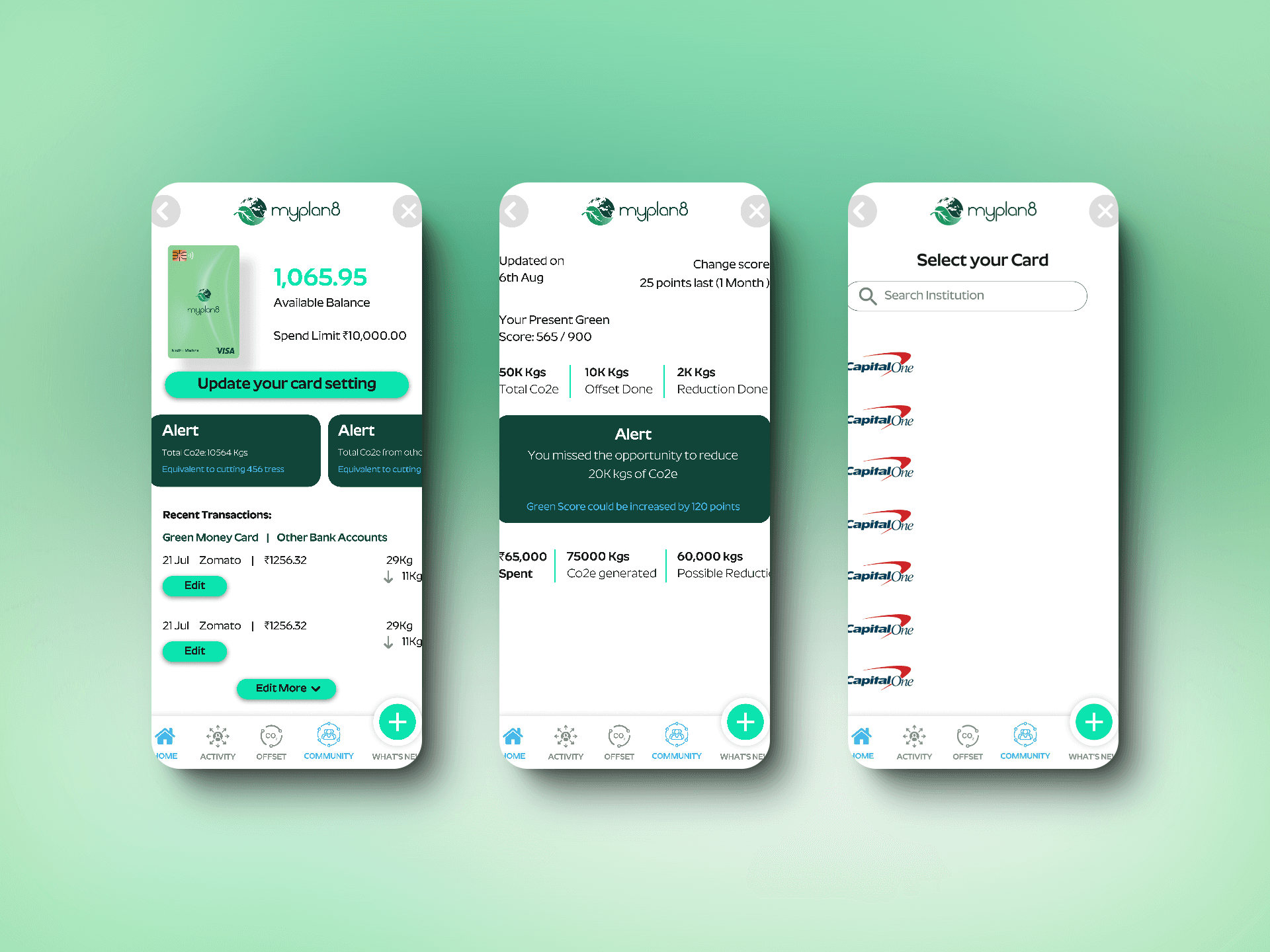
Image: Before ReDesign
What was the goal?
The goal was to redesign Myplan8 to:
1. Simplify onboarding for first-time users and improve the understanding of eco-conscious living and the Green Score™.
2. Enhance user engagement by introducing gamification and rewards.
3. Seamlessly integrate new features (Green Money Card, Green Shoppers, automation) into the app’s user journey.
4. Retain existing users while catering to new adapters.
4. Community based login as a B2B2B platform for corporate users.
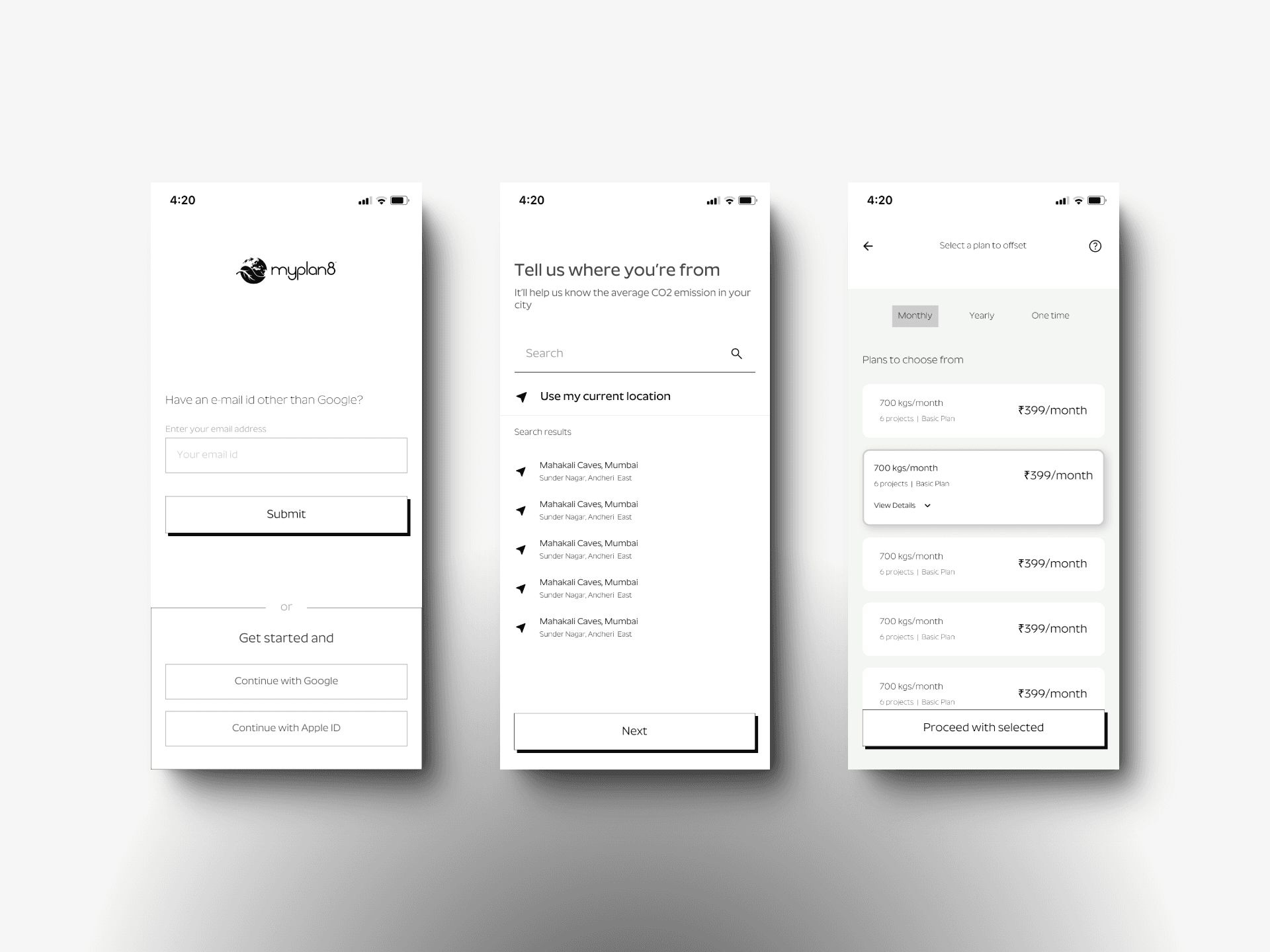
Image: Wireframes
Our Process
We followed a systematic approach divided into five key phases:
1. Discovery and Analysis
• Audit the Existing Experience: Reviewed 35 existing app screens to identify friction points in the user journey.
• User Feedback Analysis: Analyzed insights from the 800+ CUG participants to pinpoint pain areas and feature expectations.
2. Goal Definition and User Segmentation
• Defined Key Metrics: Improve Green Score™ adoption among new users by 25%.
• Segmented Users:Grouped users into “new adapters” and “existing eco-conscious users” to tailor journeys.
3. Ideation and Journey Mapping
• User Journey Maps: Mapped out current and redesigned user journeys to identify opportunities for improvement.
• Wireframes: Created low-fidelity wireframes focusing on onboarding, feature discoverability, and the new sections (Green Money Card, Green Shoppers).
4. Design and Prototyping
• Visual Design: Created a cohesive, minimalistic design language aligned with the Myplan8 brand.
• Interactive Prototypes: Developed prototypes for key flows, such as onboarding, Green Money Card, and Green Shoppers sections.
• Gamification Elements: Designed badges, milestones, and a progress tracker for the Green Score™ to encourage user engagement.
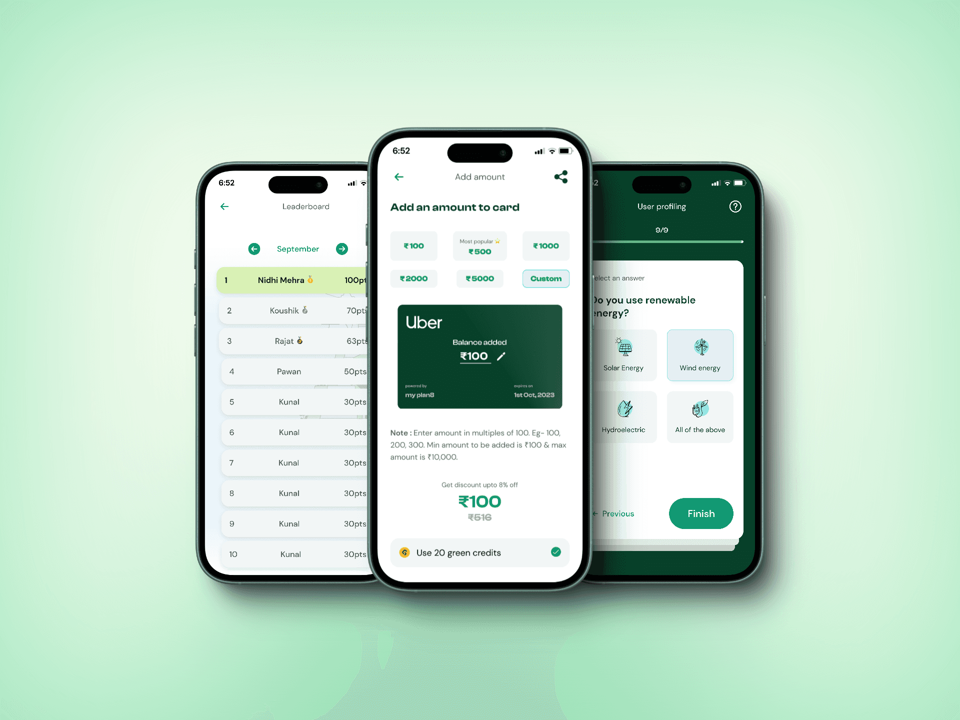
Image: After ReDesign
What did we do?
1. Redesigned the Onboarding Experience:
• Simplified eco-conscious concepts through an interactive onboarding flow with visual storytelling.
• Used engaging micro-interactions to explain the Green Score™ and its benefits.
2. Integrated New Features:
• Green Money Card: Designed a wallet-like interface showing balance, earning history, and redemption options.
• Green Shoppers Section: Introduced a curated marketplace for eco-friendly products with personalized recommendations.
• Community Login: An invite code community specifically created for workplaces to join as a team which will have its own leaderboards and stats.
3. Added Gamification and Rewards:
• Introduced milestones, badges, and leaderboards to celebrate user progress and improve motivation.
4. Streamlined Navigation:
• Optimized screen layouts and restructured navigation to reduce complexity for new users.
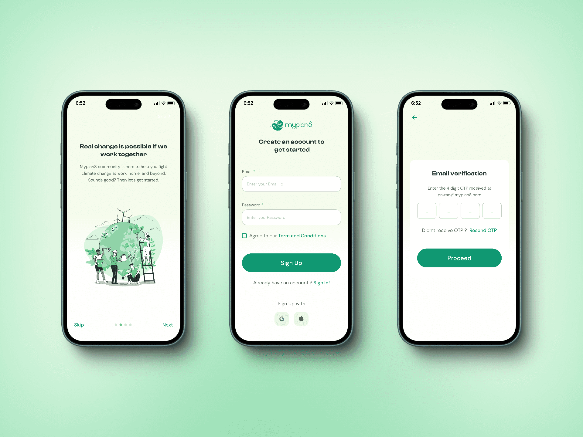
Image: After ReDesign
Results
1. Higher Feature Engagement:
• 30% of new users actively explored Green Money Card and Green Shoppers sections within their first month.
2. Increased Green Score™ Adoption:
• Green Score™ adoption rate improved by 27%, with users reporting a clearer understanding of its value.
3. Positive Feedback:
• New users found the onboarding “engaging and informative,” while existing users appreciated the seamless integration of new features.
4. Enhanced Scalability:
• Modular design ensured the app catered effectively to both new and existing users.
The redesign successfully bridged the gap between the brand’s eco-conscious mission and user adaptability, setting the stage for future growth and engagement.
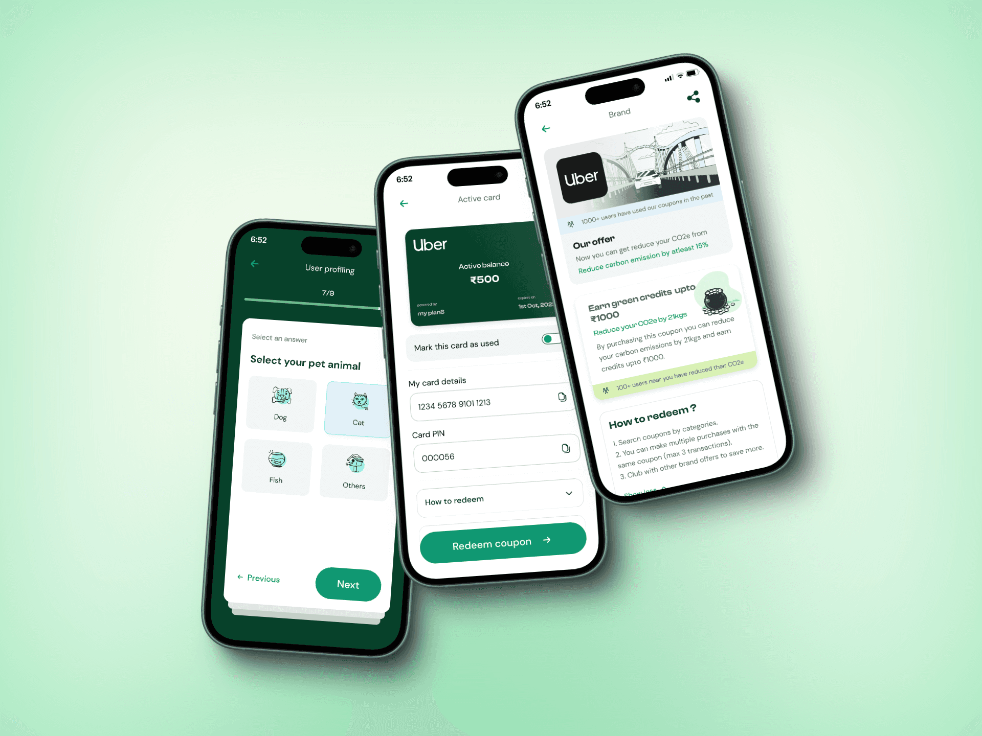
Image: After ReDesign